| « And Bible 4.0 Bookmarks | And Bible: First Look » |
And Bible: Easy on the Eyes
When And Bible is first installed it uses standard fonts and sizes, but you can modify that to suite your personal tastes. When I read a physical Bible, the text is prominent while the footnotes and comments are in a smaller type. That is what this exercise will do.
This is a demonstration of the process using my tastes as a guide. Before you get started you will need to do a little setup. If you want to follow along without messing with your existing windows, documents, etc. you can simply create a new workspace and use that for this exercise.
Setup
When And Bible first opens, or when a new workspace is created there is a single window. Presently if you only have one window and create a new window And Bible uses the existing window formatting to create the new window. What I am doing is modifying the main window while leaving the added window much like the default. In order to preserve the standard formatting for the second window, the first thing you need to do is create a new window. Ideally the second window would be for supplemental reading, i.e. commentaries, so you may want to select a commentary for this window.
Secondly, since we're going to select a font that is not normally installed, go to Download Documents. Select Add-ons as the type, and download FontPack. With two windows showing select the top window.
The third thing I would do for this exercise is turn off bookmarks. Do this by going to the three dot vertical menu, select All text options, and untick Show bookmarks near the bottom.
Be careful to select the correct menu for All text options. The menu from the top will apply changes to all windows. Each window has a faint icon in the top right corner. Changes from that menu will apply changes to only that window.
All Windows
Before changing individual windows you can change the defaults for each window in this workspace. For now, the only thing I'm changing is the line-spacing. Also under All text options, select line spacing and lower it to 1.4x. Obviously you would want to make other changes here to where the text is readable to you. If the text is too faint you may want to change to "sans serif medium" or "sans serif black".
Passage Window
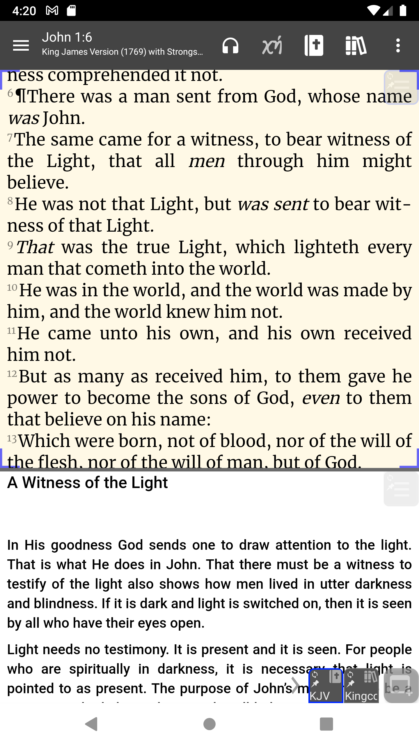
As a graphic designer I've always been told that a serif font is much easier to read for long text. Since I want it to look like I'm reading a physical Bible I want to make it really easy to read, so I'll use a larger font size.
Within the top window there is a faint icon at the top right corner which contains the window menu. Select that and the "All text options" and make the following changes
- Increase font size about 20%. The default depends on your device. On mine I change 16 pt. to 19 pt.
- Font family. Change sans serif to a serif font like Literata Regular or Merriweather.
- Line spacing. Change 1.6x to 1.3x
- Select Red letter if you like that kind of thing. As a study bible I find that a little distracting.
- Enable One verse per line
Now, to limit some of the glare from white pages, we can change the background to something with a little color. A very light tan will work for that. Under the window All text options, select Color settings, and tap on the Background color swatch. Select the gold swatch, then select the first swatch at the bottom for a subtle change in color.
Since the passage is the focus of our study, I tend to expand it to take most of the window. Simply drag on the dividing line to adjust the size of each window.
Admire your work so far.
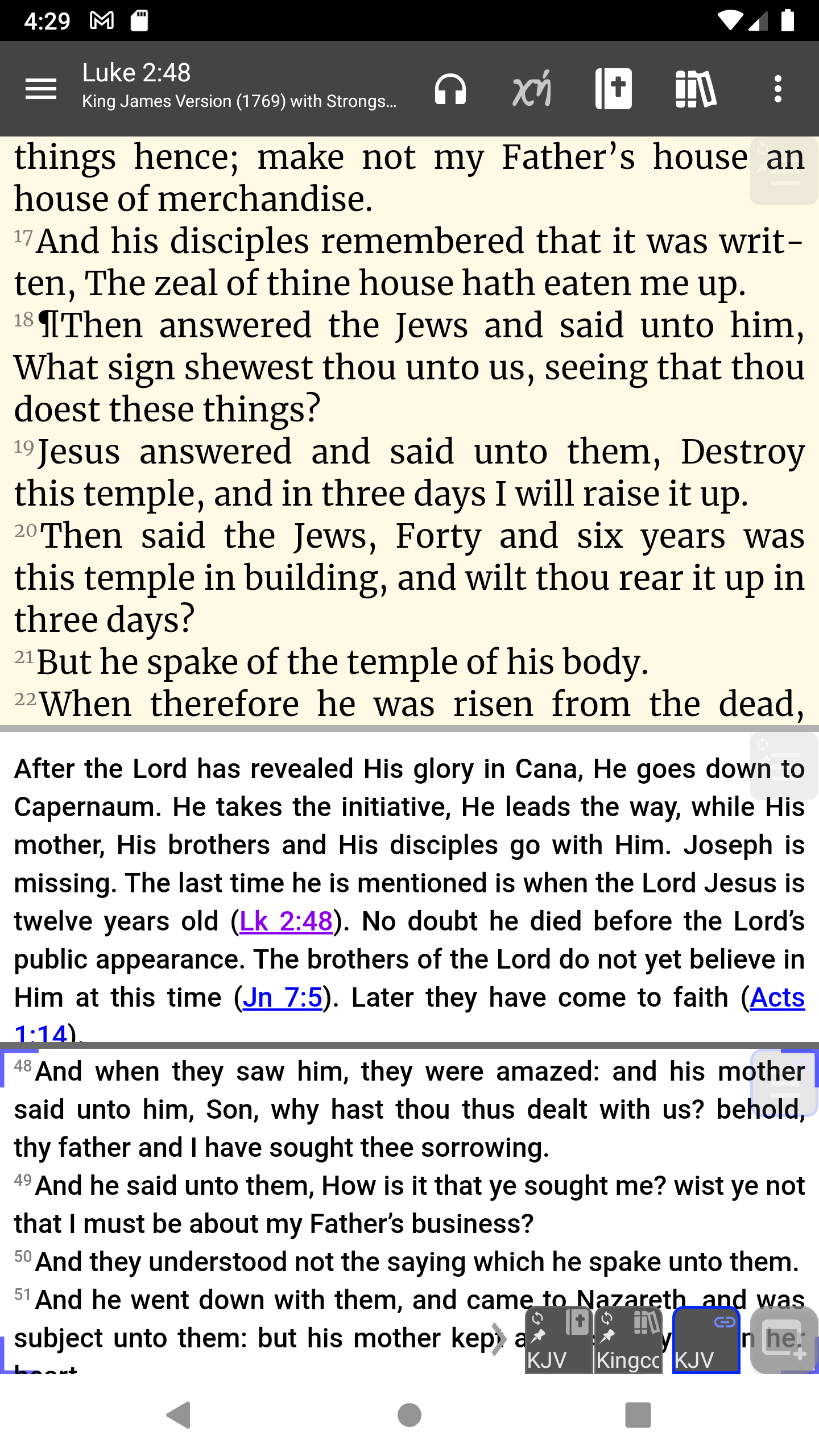
We could stop here but there is another window we can format to make our study more consistent. In the commentary window find a verse reference (in blue) and tap on that. This opens a special window. Since it is another passage, I find it helpful to set that window to One verse per line as well.
Now And Bible looks like this:
Everybody's taste is different, but now that you know how to design your windows, make all the changes you want. If you want more windows remember that the new window icon creates new windows based on the selected window.
Once you are finished, you can use the workspace as a template for other workspaces. Simply select the Workspaces... from the main menu, then tap on the three vertical dots, and select Copy as new. Name the new workspace and save changes


